Visualizing for Log Data with Kibana Lens
In the previous blog post, we discussed how to set up the Elasticsearch, Logstash, and Kibana (ELK) stack for log collection and analysis. Now that your ELK stack is running, it's time to start analyzing and visualizing your log data with Kibana Lens.
Kibana is an intuitive web interface that makes it easy to create and customize dashboards to gain insights into the performance and behavior of your applications. With Kibana, you can quickly filter and aggregate your log data to identify patterns and trends. You can also create visualizations such as line charts, bar charts, and pie charts to help you better understand your data.
This post will show examples of using Kibana to visualize log data. We will be using the example log data that we created in the previous blog post.
The log data includes the hostname, app_name, container_id , log_level , message , request_url and parameters fields.
Creating a Data View
Once you set up the ELK stack, you can access the Kibana web interface by navigating to http://localhost:5601 in your web browser. A dashboard is a collection of visualizations and searches that allows you to view and analyze your data quickly. To create a dashboard, you first need to create a data view. In the data views, we need to define index patterns that we want to use in the dashboard. It would be best to jump into the Dashboard tab under the Analytics section to create a data view. After that, you can click the Create data view button and see the popup below.
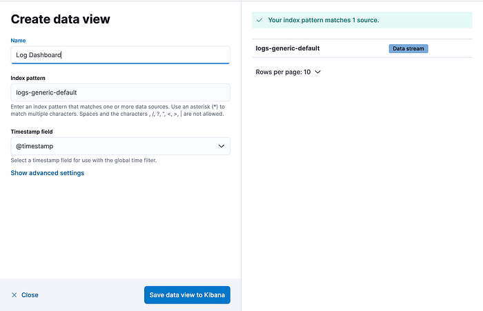
In this popup, you need to give a name for the dashboard and define an index pattern and click the Save data view to Kibana button. In our example, we will use the logs-generic-default index.
Creating a Dashboard
Once you have created a data view, you can create a dashboard and add visualizations to your dashboard. To create a visualization, click the "Create Visualization" button on the left, select the type of visualization you want to make, and configure the visualization settings.
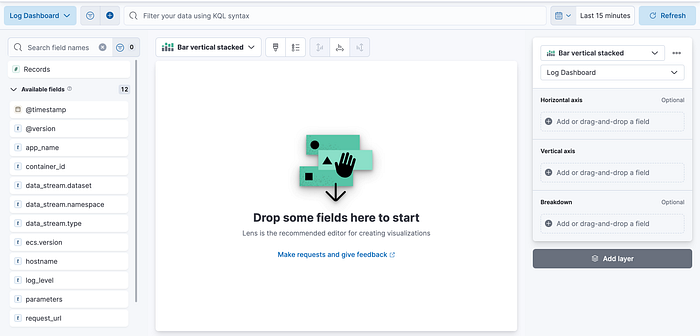
A bar chart is a great way to compare the values of a particular metric, such as the number of messages, across different categories, such as the log level or the application name. To create a bar chart, you would set the horizontal axis as timestamp and the vertical axis as count of records and then to grouping, drop the log_level field into the Breakdown section.
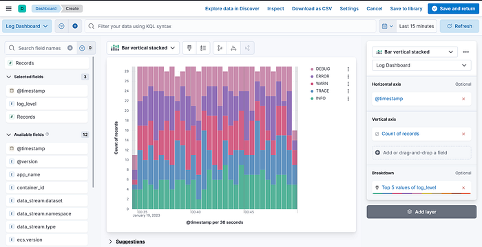
After the configuration fields, you need to click Save and return the button. Congratulations 🎊, you created the first visualization for your dashboard.
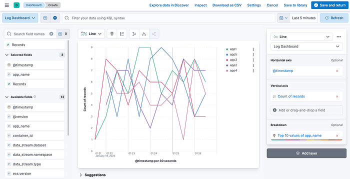
Line Chart: This visualization is suitable for tracking a metric over time. For example, we can use a line chart to track the number of messages per minute. To create this visualization, you would set the horizontal axis to timestamp and the vertical axis to the Metric you want to track, such as the count of records.
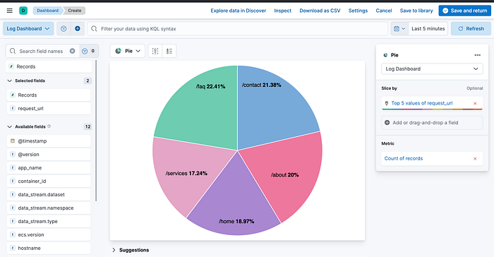
Pie chart: This visualization is suitable for showing the distribution of a particular field in your log data. For example, you can use a pie chart to show the distribution of request URLs in your log data. To create this visualization, you would set the Slice by as the request_url and Metric as the count of records.
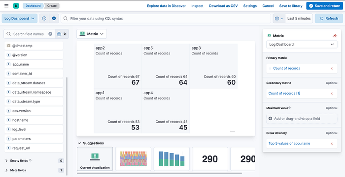
Metric visualization: This visualization can show a single metric in a simple and easy-to-read format, such as the number of records for each application name. This can be useful for displaying critical metrics on a dashboard.
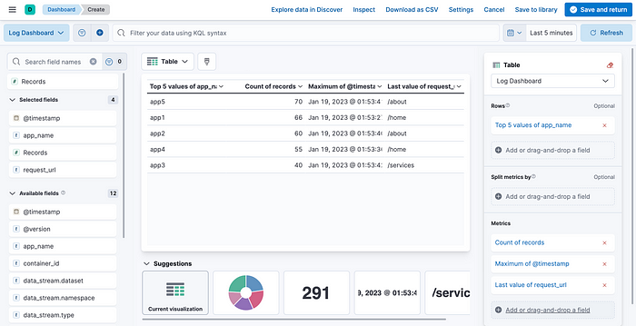
Tabular table: To show raw data in a tabular format. This can be useful for displaying detailed log data on a dashboard or exporting data for further analysis.
Area chart: This visualization helps track a metric over time and shows the relative proportions of multiple metrics. For example, you can use an area chart to track the number of errors and warning messages over time.
Heatmap: To show a metric's distribution over time and across different categories. For example, you can use a heatmap to show the number of requests per hour and day of the week.
Gauge: To show a single metric, such as the percentage of successful requests, in a simple and easy-to-read format. This can be useful for displaying critical metrics on a dashboard.
Maps: To show geographical data on a map. This can be useful for visualizing log data that includes location information, such as IP addresses.
These are just a few examples of the many visualizations that can be used to analyze log data. The best visualization will depend on the specific data you have and the insights you want to gain from that data.
After adding all visualization, it is time to save the dashboard, and that's it. 🚀🚀🚀
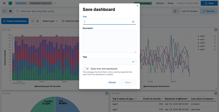
In conclusion, using the log data, you can create a dashboard and visualizations in Kibana that allow you to view and analyze your data quickly. You can also set up alerts in Kibana to notify you of important events or anomalies in your logs. With these tools, you can gain valuable insights into the performance and behavior of your applications and quickly identify and resolve issues. The above examples are just a starting point, and you can continue to explore and experiment with Kibana to discover new ways to analyze and visualize your log data.
Cheers!
